Search Our Site
")


Gumerflat.
A 300m de la Puerta del Sol
Alojamiento en Madrid, a 100 metros de la Fnac y a 300 metros de la Puerta del Sol. El apartamento se encuentra a 700 metros de la Plaza Mayor de Madrid y proporciona conexión WiFi gratuita en todas sus instalaciones.
La Latina.
Alójate en el corazón de Madrid
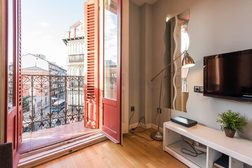
Recién reformado, al inicio del barrido de La Latina, y a 100 metros de la Plaza Mayor.Apartamento exterior que oferece mucha luz y preciosas vistas desde su balcón.
Muy Cerca de la Plaza Mayor
El centro de Madrid es una opción genial para los viajeros interesados en salir de noche, comer tapas, la arquitectura...Nuestros clientes dicen que esta parte de Madrid es su favorita, según los comentarios independientes.

GUMERFLAT - CENTRICAL APARTMENT
Madrid, Comunidad de Madrid, España
Apartamento decorado con un estilo elegante y acogedor, muy tranquilo y luminoso, situado en la zona privilegiada del centro de Madrid, entre Sol y Gran Vía, una ubicación perfecta y el sitio ideal...
CENTRICAL APARTMENT IN "LA LATINA"-"PLAZA MAYOR"
Madrid, Comunidad de Madrid, España
Apartamento recién reformado, al inicio del barrido de La Latina, y a 100 metros de la Plaza Mayor. Apartamento exterior que oferece mucha luz y preciosas vistas desde su balcón. Te permite ir an...

Gumerflat.
Todo al alcance de la mano
Las distancias se acortan desde Gumerflat Coverse, Por ejemplo, el Teatro Real esta a 400m, tan sólo 6 minutos a pie. Ver Disponibilidad

Gran Vía
¡A sólo 2 minutos!- 142m a pie -

Puerta del Sol
¡A sólo 4 minutos!- 286m a pie -

Conéctate con todo Madrid
Dispones de varias estaciones de metro muy cercanas para poder ir a cualquier parte de Madrid.Ver Disponibilidad

Callao
¡A sólo 2 minutos!- 140m a pie -

Sol
¡A sólo 3 minutos!- 240m a pie -

La Latina.
No hay distancias.
A sólo 100 metros de la Plaza Mayor estarás rodeado de los restaurantes más bohemios de la ciudad.Ver Disponibilidad

Teatro Calderón
¡A sólo 4 minutos!- 280m a pie -

Puerta del Sol
¡A sólo 7 minutos!- 500m a pie -
Occasionally we need to use custom html to obtain the layouts shown on our demos in specific modules. The code below is what was used on this template:


Homepage Icon Boxes:
<div id="icon_boxes">
<div id="icon_box1" class="icon_box">
<div class="icon_box_inner">
<a href="index.php/features-mainmenu-47/template-specific-features">
<span class="ion-ribbon-b icon_box_icon"></span>
<h3>Award Winning Customer Satisfaction</h3>
<span class="icon_box_subtext">Lorem ipsum dolor sit amet, consectetur adipiscing elit. Sed a massa sapien. Praesent non sem vitae tortor ornare dictum id sed eros morbi vehicula</span>
</a>
<div style="clear:both;"></div>
</div>
</div>
<div id="icon_box2" class="icon_box">
<div class="icon_box_inner">
<a href="index.php/features-mainmenu-47/template-specific-features">
<span class="ion-heart icon_box_icon"></span>
<h3>We Put Our Heart And Soul Into All We Do</h3>
<span class="icon_box_subtext">Sed a massa sapien. Praesent non sem vitae tortor ornare dictum id sed eros morbi vehicula Lorem ipsum dolor sit amet, consectetur adipiscing elit.</span>
</a>
<div style="clear:both;"></div>
</div>
</div>
<div id="icon_box3" class="icon_box">
<div class="icon_box_inner">
<a href="index.php/features-mainmenu-47/template-specific-features">
<span class="ion-cloud icon_box_icon"></span>
<h3>The Comfort We Offer Has No Limits</h3>
<span class="icon_box_subtext">Lorem ipsum dolor sit amet, consectetur adipiscing elit. Sed a massa sapien. Praesent non sem vitae tortor ornare dictum id sed eros morbi vehicula</span>
</a>
<div style="clear:both;"></div>
</div>
</div>
<div style="clear:both;"></div>
</div>
Tab Show Area:
<div class="tab_left">
<div class="overlay_hover_outer tab_large_img">
<div class="overlay_hover_inner">
<div class="overlay_centered">
<a href="">
<span class="overlay_icon ion-android-open"></span>
</a>
</div>
</div>
<img src="images/tab1_large.jpg" alt="" />
</div>
<div class="tab_large_text">
<h3>Enjoy Our Executive Suite Package</h3>
Lorem ipsum dolor sit amet, consectetur adipiscing elit. Sed a massa sapien. Praesent non sem vitae tortor ornare dictum id sed eros. Morbi vehicula luctus finibus aliquet sed metus commodo, tempor hendrerit.
<br />
<a href="" class="readon">View All Rooms</a>
</div>
<div style="clear:both"></div>
</div>
<div class="tab_right">
<div class="tab_right_row">
<div class="overlay_hover_outer">
<div class="overlay_hover_inner">
<div class="overlay_centered">
<a href="">
<span class="overlay_icon ion-android-open"></span>
</a>
</div>
</div>
<img src="images/tab1_small1.jpg" alt="" />
</div>
<span class="tab_right_row_text">
<h4>Standard View Room Options</h4>
Nam sed nulla sit amet lorem el velit.
</span>
<div style="clear:both"></div>
</div>
<div class="tab_right_row tab_right_row_right_img">
<div class="overlay_hover_outer" style="float:right">
<div class="overlay_hover_inner">
<div class="overlay_centered">
<a href="">
<span class="overlay_icon ion-android-open"></span>
</a>
</div>
</div>
<img src="images/tab1_small2.jpg" alt="" />
</div>
<span class="tab_right_row_text">
<h4>Ocean View Room Options</h4>
Donec mattis ac dolor fringilla sollic itudin.
</span>
<div style="clear:both"></div>
</div>
<div style="clear:both"></div>
</div>
Our Resort Row:
The background of this area is controlled by the Backgrounds tab in Vertex
<a href="index.php/features-mainmenu-47/template-specific-features">
<div class="title_block">
Our Resort
<span>Voted #1 Travel Destination</span>
<div style="clear:both"></div>
</div>
</a>
<div class="title_block">
Our Resort
<span>Voted #1 Travel Destination</span>
<div style="clear:both"></div>
</div>
</a>
Customer Quote:
These are published to the S5 Tab Show module on the homepage.
<div class="quote_box">
<img alt="" src="images/cust1.jpg">
<div class="quote_text">
“Lorem ipsum dolor sit amet, consectetur aled leium adipiscing elit. Donec lobo tis vestibulum lorem ipsum ligula.”
<br>
<span class="quote_name">- Melissa Heath via Yelp</span>
</div>
<div style="clear:both"></div>
</div>
<img alt="" src="images/cust1.jpg">
<div class="quote_text">
“Lorem ipsum dolor sit amet, consectetur aled leium adipiscing elit. Donec lobo tis vestibulum lorem ipsum ligula.”
<br>
<span class="quote_name">- Melissa Heath via Yelp</span>
</div>
<div style="clear:both"></div>
</div>
Bottom Display Area:
<div class="bottom_display">
<div class="overlay_hover_outer bottom_display_left">
<div class="overlay_hover_inner">
<div class="overlay_centered">
<a href="">
<span class="overlay_icon ion-android-open"></span>
</a>
</div>
</div>
<img src="images/bottom1.jpg" />
</div>
<div class="bottom_display_text">
<h3>Come See Our Brand New Ballroom And Spa</h3>
Proin rhoncus sagittis tristique. Suspendisse interdum magna sed eros egestas, porttitor lobortis augue pretium. Praesent consectetur pretium urna. Sed aliquet, tellus vitae rrhon.
Convallis pulvinar. Vivamus sit amet maximus erat, sed vulputate arcu. Maecenas commodo justo eget velit ornare, id facilisis erat semper.
<br />
<a href="" class="readon">See All Features</a>
</div>
<div class="overlay_hover_outer bottom_display_right">
<div class="overlay_hover_inner">
<div class="overlay_centered">
<a href="">
<span class="overlay_icon ion-android-open"></span>
</a>
</div>
</div>
<img src="images/bottom2.jpg" />
</div>
<div style="clear:both"></div>
</div>
Signup Area:
This module also uses the highlight1 module class
<div class="highlight1_block">
<span>Try Luxon For Yourself Today</span> <a href="http://www.shape5.com/join-now.html" target="_blank" class="readon">Signup Today</a>
<div style="clear:both"></div>
</div>
<span>Try Luxon For Yourself Today</span> <a href="http://www.shape5.com/join-now.html" target="_blank" class="readon">Signup Today</a>
<div style="clear:both"></div>
</div>
Bottom Icon Area:
<div class="icon_showcase">
<h3>Find Out What Makes Us The Best Hotel In The Area</h3>
<span class="icon_showcase_subtext">Proin rhoncus sagittis tristique. Suspendisse interdum magna sed eros egestas, porttitor lobortis augue pretium. Praesent consectetur pretium urna. Sed aliquet, tellus vitae rhon.</span>
<div class="icon_showcase_item">
<img src="images/bottom_icon1.jpg" alt="" />
<div>Proin rhoncus sagittis tristique. Suspendisse interdum magna sed eros egestas, porttitor lobortis augue pretiu ipsum praesent.</div>
</div>
<div class="icon_showcase_item">
<img src="images/bottom_icon2.jpg" alt="" />
<div>Lorem ipsum dolor sit amet, consectetur adipiscing elit. Nullam mollis pretium maximus ac eros vitae nulla dapibus lorem facilisis.</div>
</div>
<div class="icon_showcase_item">
<img src="images/bottom_icon3.jpg" alt="" />
<div>Nam sed nulla sit amet velit ullamcorper lobortis. Vivamus a velit in ex faucibus sodales. Nunc tristique iaculis nisl amet dapibus.</div>
</div>
<div class="icon_showcase_divider"></div>
<div class="icon_showcase_item">
<img src="images/bottom_icon4.jpg" alt="" />
<div>Vivamus ornare molestie lorem, lobortis viverra nibh vestibulum a. Maecenas ut feugiat lacus, ac eros vitae null sed convall velit.</div>
</div>
<div class="icon_showcase_item">
<img src="images/bottom_icon5.jpg" alt="" />
<div>Maecenas bibendum posuere nisl. Cras tincidunt ex imperdiet, scelerisque tortor maximus ac eros vitae placerat augue.</div>
</div>
<div class="icon_showcase_item">
<img src="images/bottom_icon6.jpg" alt="" />
<div>Proin rhoncus sagittis tristique. Suspendisse interdum magna sed eros egestas, porttitor lobortis augue pretiu ipsum praesent.</div>
</div>
<div style="clear:both"></div>
</div>
The Mail Chimp Signup module is demo'd on this page. The module is AJAX powered and allows your users to instantly signup and get added to your MailChimp list that you specify in the module admin. All you need to do is enter your MailChimp API Key and Unique List ID. The styling of the module shown here is customized specifically for this template with css overrides, and cannot be used with any other template. The same module can be used on any template, but with default or other styling in its place.

Ion Icons is an iconic font that gives you scalable vector icons that can be customized by any font css command, such as size, color, backgrounds, hover effects and more. Below you will see several examples of this feature in action, but please visit http://ionicons.com/ for a full list of all icons available.
Round icon example:
<div class="icon_outer_wrap">
<div class="icon_hover">
<a href="" class="ion-link icon_element"></a>
</div>
<div class="icon_non_hover">
<span class="ion-headphone icon_element"></span>
</div>
</div>
<div class="icon_hover">
<a href="" class="ion-link icon_element"></a>
</div>
<div class="icon_non_hover">
<span class="ion-headphone icon_element"></span>
</div>
</div>
Icon Examples:
<span class="ion-camera" style="display:
inline-block;font-size:2.5em;"></span>
The S5 Quick Contact module is a free module, and is demo'd on this page. This module is a simple way for your visitors to get in contact with you. Sometimes full contact pages are just too much. If you're looking for an easy way to stay in contact with your visitors this module is for you. This module has fully configurable language settings, sends emails to a specified admin account, captcha spam protection and much more! And of course it's free!
The styling of the module shown here is customized specifically for this template with css overrides, and cannot be used with any other template. The same module can be used on any template, but with default or other styling in its place.
The styling of the module shown here is customized specifically for this template with css overrides, and cannot be used with any other template. The same module can be used on any template, but with default or other styling in its place.
Menu Features:
- Mail is sent directly through the Joomla mail function, defined under the Joomla globlal configurations. This means the mail can send through direct php mail functions or through SMTP authenticaion.
- In addition to the Name and Email fields, you can set up to ten customized fields (all completely optional). These fields can be a regular text input, a full textarea, drop down select, or a date selection field.
- Set any custom field to either required and not required.
- The styling of each input, textarea, and button is controlled by common Joomla classes, so it will match your template out of the box. The styling shown on this demo is specific to this template using the mentioned classes.
- In addition to the default class names you can also set widths, paddings, and margins.
- Predefine a subject or let the user enter their own.
- You can customize all error messages to any text or language that you would like directly from the module's backend.
- Set the wording for all fields to any words or language that you would like, eg: Name, Email, Phone, etc.
- There are multiple layers of spam protections. The first is done by the built in captcha methods, that you can enable or disable. The second is automatic, the script will automatically detect mail headers to prevent spammers. Third, you can enter up to 30 word exclusions that you do not wants your users submitting.
Our Scroll Reveal feature is powered by the script found here: https://github.com/julianlloyd/scrollReveal.js. The script allows you to add "data-scroll-reveal" to HTML elements for on page scroll animations. We recommend adding to DIVs over SPAN etc as DIVs can move vs SPAN tags just fading in. Once you add the code to a DIV refresh a page or scroll down and it will animate in. It will only do this once until you refresh the page again. The great feature about the script is you can use plain English to describe how you'd like to animate your HTML element.
Example of this in action (refresh this page if you didn't see it already):
Enter from the left and move up 50px in 1.33 seconds.
Enter from the bottom after 1 second.
Wait 2.5 seconds and then ease-in-out 100px.
Code used for the above:
<div data-scroll-reveal="enter left and move 50px over 1.33s"> Enter from the left and move up 50px in 1.33 seconds. </div>
<div data-scroll-reveal="enter from the bottom after 1s"> Enter from the bottom after 1 second. </div>
<div data-scroll-reveal="wait 2.5s and then ease-in-out 100px"> Wait 2.5 seconds and then ease-in-out 100px. </div>
<div data-scroll-reveal="enter from the bottom after 1s"> Enter from the bottom after 1 second. </div>
<div data-scroll-reveal="wait 2.5s and then ease-in-out 100px"> Wait 2.5 seconds and then ease-in-out 100px. </div>
Usage:
For a lengthier explanation on this visit the following page: https://github.com/julianlloyd/scrollReveal.jsContÁctANOS
Contáctanos
Reservas
Gracias por contactar con nosotros! Por favor, rellene el siguiente formulario y nuestro personal se pondrá en contacto con usted lo antes posible.